Categories
- News (124)
- case study (6)
Recent News & Blog
 Why Museums Are Turning to Fine Pitch LED Displays for Better Visitor Engagement
The first time I stood right in front of a fine pitch screen, I actually leaned in just to check if my eyes were playing tricks on me. The details were that sharp — almost unnervingly crisp, like someone had lifted a movie scene off the reel and hung it on the wall.
As someone who loves to scrutinize details, I wasn’t satisfied with just “it looks good.” I wanted to understand why it was so good, how to reproduce that quality in real projects, and what pitfalls are easy to overlook. What follows are the experiences I’ve gathered from years of playing with, evaluating, coordinating installation and debugging fine-pitch LED screens — told in the most straightforward, first-person way I can. My hope is to help you avoid unnecessary detours when making decisions.
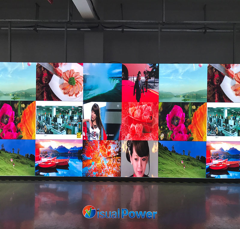
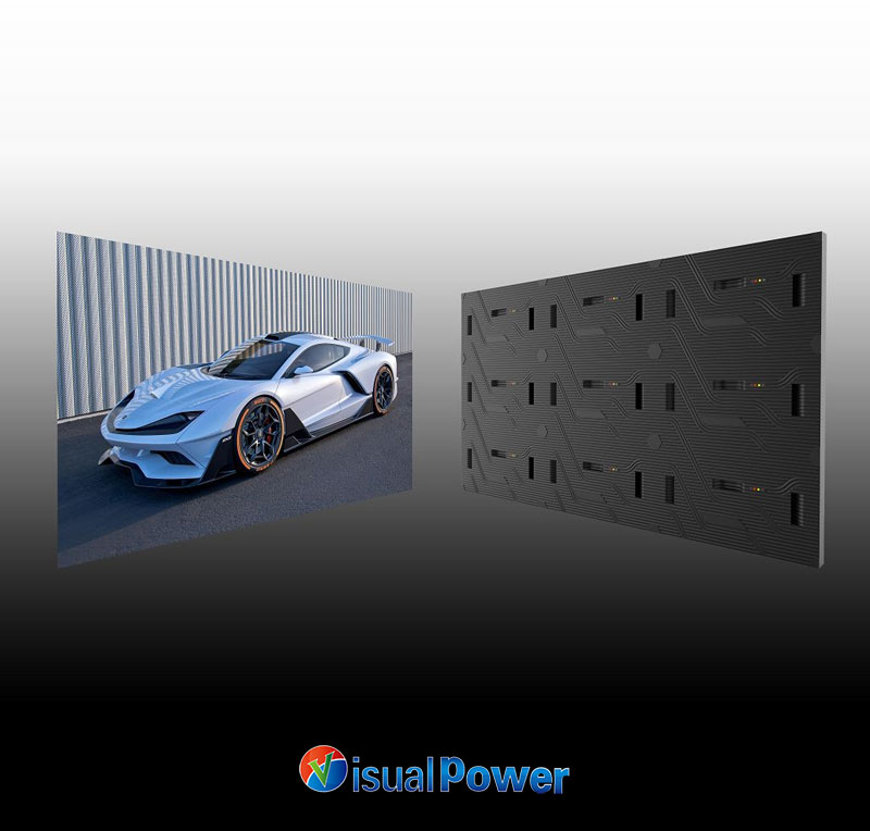
For me, “fine pitch” finally clicks when you think about the tiny gaps between pixels. Put another way: the tighter the pixel spacing, the less visible each dot becomes — so up close the image stops looking grainy. In practice, anything with a pixel pitch below roughly 2 mm is usually called fine-pitch. You’ll often see names like P0.9, P1.25, P1.56 and P1.875. They are applied in various scenarios, ranging from television studios, command and dispatch rooms, to high-end exhibitions and meeting rooms.
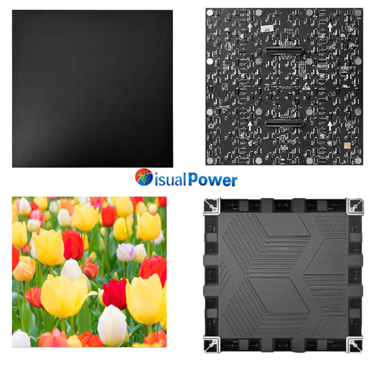
Once at a trade show, I stood in front of a P0.9 screen. The skin details and font edges in the picture were so clean that it made me feel a bit uneasy – it wasn’t just a display technique, but it directly improved the communication efficiency. Later, I reviewed many product pages (including those of manufacturers like VisualPower, which had parameter pages), and I discovered that the details such as the moduleization, thickness, and weight of the product would directly determine the installation method and the complexity of subsequent maintenance. If these weren’t thought through in the early planning, the project budget would be quietly reduced by a large amount.

A handy rule I use: multiply pixel pitch in millimeters by about 3.44 to get the minimum viewing distance in meters where individual pixels blend together.
So roughly:
So before you pick a panel, check where people will actually sit or stand — match the pitch to that distance and you’ll get much better ROI on both money and impact.
Practical suggestion: For scenarios where close reading of text or charts is required, such as in meeting rooms, control rooms, and broadcasting studios, P0.9 – P1.56 should be given priority; for shopping malls and large background screens, a larger spacing can be considered.
Quick tip: if people need to read text up close — think control rooms, studios, or conference rooms — aim for P0.9–P1.56. For mall backdrops or distant viewing, larger pitches are fine.
Spacing matters, but three other things usually make or break the final picture:
Refresh & drive: If the wall will be filmed or used for live video, low refresh shows up as flicker or rolling artifacts — a high, steady refresh is non-negotiable for broadcast work.
Color & brightness matching: A big panel is many modules; without tight calibration you’ll see stripes or color drift. Point-by-point correction matters.
Packaging (SMD/COB/MicroLED): How the LEDs are packaged affects density, uniformity, serviceability and lifespan — choose based on your tradeoffs.
This is where opinions usually split. From projects I’ve been on, here’s how I think about the tradeoffs:
The SMD type of traditional packaging, I often refer to it as a “proven performer” – it has mature technology and the price is relatively reasonable. The most crucial point is that broken LEDs can be replaced individually, which is very convenient for the maintenance team. For most conventional indoor projects, it is sufficient to use this type.
The main advantage of COB is quite obvious: the chips are placed directly closer to the substrate, resulting in a much smoother overall image and a more durable surface. However, this type of screen requires high standards for production and calibration processes. Therefore, it is essential to choose a reliable manufacturer at the beginning; otherwise, the color adjustment process later on will be very troublesome.
As for MicroLED, its color and contrast are truly astonishing. When viewed up close, it almost looks like printed material. However, the current price is still high, and mass production is not yet fully mature. It is more suitable for occasions where one has a large budget and wants to create a flagship-level display, such as high-end exhibition halls or studios.
My selection logic is quite straightforward: First, lay out the usage scenarios and budget on the table, clearly define the most important indicators, and then see which technical route can meet this scenario. For example, if the product needs to be frequently captured by cameras, I would give priority to COB or high-refresh-rate SMD; while for ordinary mall background walls, the cost-effective SMD is usually a more reliable solution.
I treat product pages as a specs database — not as a sales pitch. Sites like VisualPower that list pitches, module sizes, thickness and weights are great for a quick sanity check before you ask for a prototype. However, a spec sheet is only the starting point — nothing beats a real demo or an in-person sample.
My love for micro Spacing LED is not driven by the pursuit of digital showmanship, but because it can truly enhance the efficiency of interaction between people and information — being able to clearly see an alarm number in the control room, reading the tiny annotations on a slide in the conference hall, or faithfully reproducing the texture of an art piece in the exhibition. These are “useful” improvements, not just for the sake of being visually appealing.
If you are currently in the project evaluation stage, my suggestion is: prioritize the line of sight and usage scenarios, place calibration and signal chain in the second position, and put packaging technology and price in the third position. By following these three steps, 99% of the time you will avoid several very costly mistakes.
Why Museums Are Turning to Fine Pitch LED Displays for Better Visitor Engagement

 Sales Manager