Categories
- News (124)
- case study (6)
Recent News & Blog
 Why Museums Are Turning to Fine Pitch LED Displays for Better Visitor Engagement
At first, I couldn’t quite explain why I was so obsessed with pixel-level detail on the screens I saw – was it the tech enthusiast at play, or did I have a vague sense that there was a deeper difference here?
The project I was in charge of was a a multipurpose meeting and display space. What the client needed was a room that could display exquisite graphics and text without appearing out of place or being overly “high-tech”. I have tried large-sized ordinary leds, large-sized LCDS, and simple projectors, but none of them have achieved that “exquisite and professional” effect. It was not until I first came into contact with the fine pitch LED display that I finally saw clearly what “high enough picture quality” meant.
The “fine pitch” of this type of display screen – that is, the tiny pixel pitch – is its essence. I used to think that “high definition” didn’t make much difference. As soon as you zoomed in, you could clearly see the stripes. But the significance of fine granularity lies in that when the viewer stands at a distance of less than one meter to watch, the picture remains smooth without any Mosaic or patchy color banding.
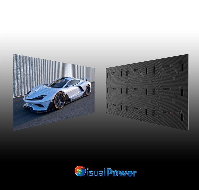
I clearly remember the first demonstration footage: a close-up of a high-end mechanical watch, from the gears to the stitching of the strap, every detail was clearly distinguishable. The customer exclaimed “Wow!” on the spot and said, “This is exactly the texture I wanted.” At that moment, I truly understood that the sense of visual detail will directly enhance the “credibility” of the content.
Many people think that this kind of equipment can be used as soon as it is bought – in fact, that’s not the case at all.
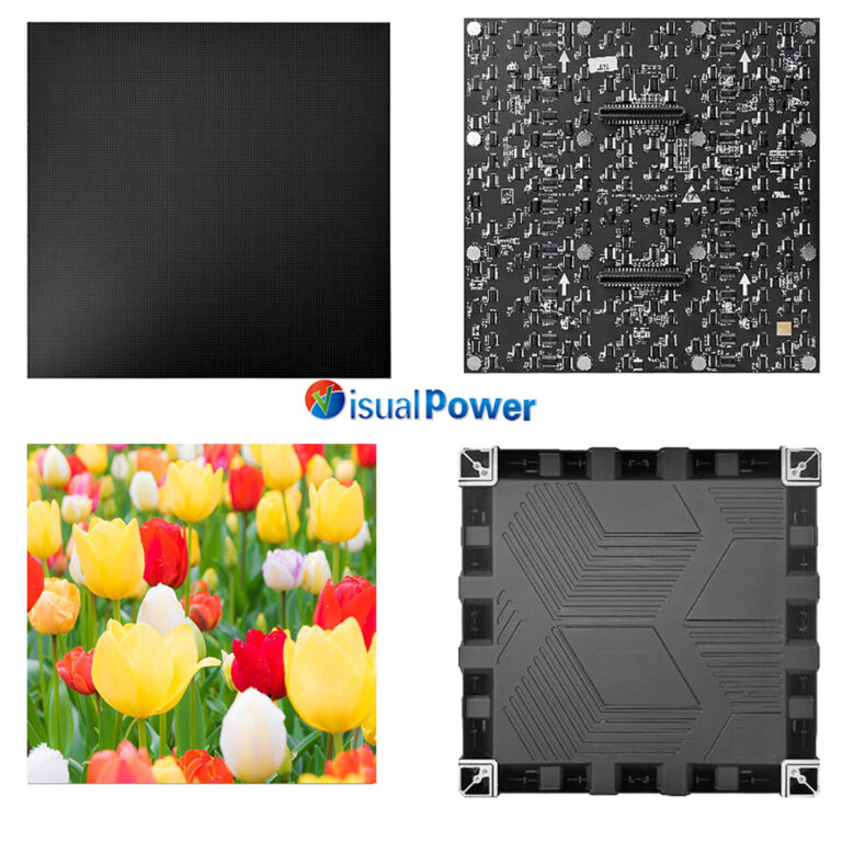
The precision of module splicing is extremely high
If the seams between each small module are not strictly controlled, even if there is an error of 0.5 millimeters, a “visible seam” will appear when viewed closely. In my project, our team repeatedly pieced together and made minor adjustments to ensure that each piece still maintained a “seamless visual effect”.
The control system needs to be precisely calibrated
The content system must support pixel-level mapping and uniform color temperature; otherwise, the display effect will result in one module being too dark and the other too cold. In practice, I chose a solution that supports professional-level color grading. Although it takes a lot of time, the effect is satisfactory.
Ventilation and heat dissipation are indispensable
Due to the dense arrangement, the heat of the fine pitch LED display screen is concentrated. We designed a dedicated air duct at the back. During the initial stage of on-site power-on, we conducted a a 72-hour stress test to confirm that there was no brightness attenuation or color shift.
These may not be the coolest parts, but they are the cornerstones of achieving a “professional quality”.
No matter how high the screen details are, it cannot bear the responsibility of showing off skills. I position the content as “professional presentation”, with the main principles being: highlighting the theme, ensuring comfortable viewing, and not stealing the spotlight of the space.
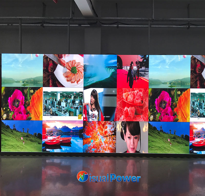
Graphic and text presentation: My presentation includes high-definition product images, 2D charts and concise animations. When viewed at a close distance of 2 meters, the sharpness of surface textures and the crispness of text edges really matter.
The combination of gradient background and static content: I designed the background with a faint gradient, making the screen look simple from a distance and have layers of details when viewed up close, which can reduce viewing fatigue.
Only after testing multiple drafts did I learn “visual harmony” : I created five versions of materials, constantly measuring color temperature, contrast, and brightness, from from daylight to interior lighting to nighttime settings, before finding the most comfortable solution.
If you have one of the following requirements, this type of equipment is worth considering
Close-up viewing: Conference tables, beside display cabinets, virtual exhibition halls – viewing within 1 meter is the norm.
High-precision graphic and text display: such as product details, medical images, artistic replicas, financial data dashboards, etc.
Long-term viewing: The content exposure time is long, and the eye burden needs to be low enough.
Focus on brand or experience texture: Your audience will care about “details” and pay for them.
But if you are just playing ordinary videos, looping ads or watching from a distance, then ordinary leds or LCDS are sufficient.
First, try out the small splicing module: I suggest building a 0.5-square-meter test wall first, test the color, measure the heat, and check for seam alignment, and then decide to do the entire surface.
Choose cold light source background lights: Pair them with warm white and cold white background lights to make the foreground of the picture more prominent and softer.
Establish a consistent content update routine: Regular software color calibration and hardware brightness checks can keep the screen in the best condition for a long time.
What I care about is not just “good looks”, but “effectiveness”. Whether it is the research and development report, the display of product parameters, or the reappearance of art exhibitions, the pinpoint clarity of fine pitch LED can make the audience trust the content and respect the information itself, rather than being distracted by the presentation form.
It is not a performance but a supplement. It’s not about showing off skills, but professionalism. It really brings me closer to the content – that sense of “closeness” visually is the rarest resonance between a designer and an audience.
Why Museums Are Turning to Fine Pitch LED Displays for Better Visitor Engagement

 Sales Manager